Improve Your Photos with the Rule of Thirds
We all want to take better pictures, so why is it that we don’t spend the time actually composing the pictures we capture with our phones? Camera – phone – phone – camera. The two are these days basically indistinguishable. But many people still treat their phones as a point and shoot snapshot camera.
You know how you have that one friend who when they show you the pictures on their phone you’re always blown away by how good they look and how you want to keep looking at them for ages?
Well the reason is not because they have a better phone than you, but because they are better at taking pictures—their composition is better so your eye knows where to look in the picture. The good news is that while you might never be as visually aware as one of the old masters like Michelangelo or Rembrandt, there are some simple ‘tricks’ you can use to make your pictures look more visually appealing.
The most simple of these is called the rule of thirds. Now it’s important to remember that photography is not about rules. While it is part science, it is also part art and art has, since the dawn of time, eschewed the rules in quite spectacular fashion. So you may wonder why we have a ‘rule’ to make pictures look better. Well, it’s simple. Beauty can be explained mathematically. There are certain ratios that our brains find attractive and when looking at an image, a painting, the Parthenon or even a flower, there are certain parts of the image that we are drawn to first: It’s a secret artists from Velasquez to Vermeer have used to draw in viewers.
Be honest, if you were to look through your phone pictures, how many of your pictures of people have the person right in the middle of the frame with lots of ‘lost’ space above their head? If the answer is “lots” then you’ve got room for improvement.
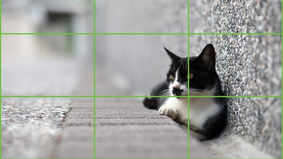
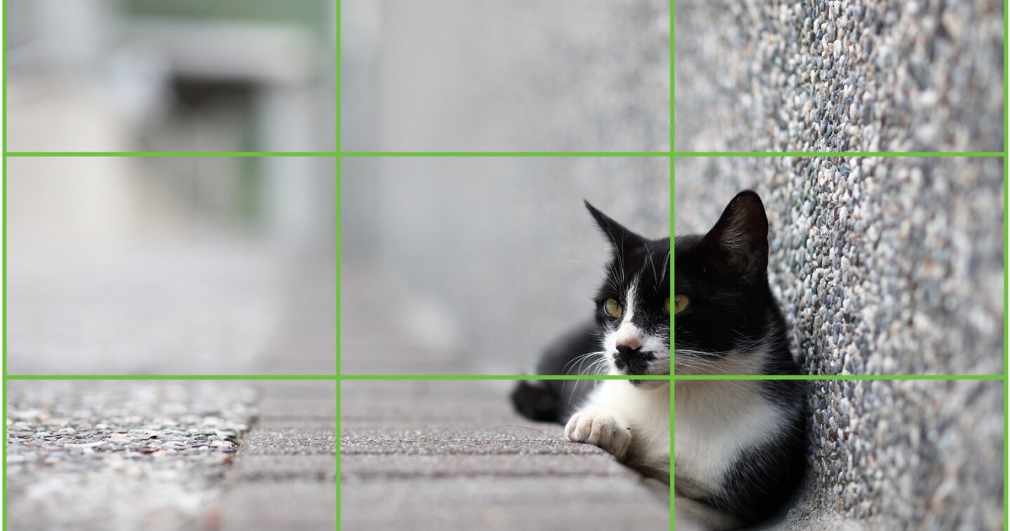
The rule of thirds is a visual cue that prompts you where to place subjects in your scene. Imagine an image broken up into thirds both horizontally and vertically. Where these thirds intersect are called cardinal points and they have more visual dominance—your eye is drawn to them more quickly. So placing a subject on one of these intersecting points makes it stand out more.

If you’re thinking of a landscape picture, those horizontal thirds are key— instead of putting the horizon across the middle of the frame, place it either on the upper third, if you want to emphasize the foreground, or lower third to include more sky. You’ll immediately feel that the image is more balanced than before.
And that’s the good news about composition—even if you’re no good at painting or drawing, you will instinctively ‘feel’ when an image looks right. Next time you’re taking pictures with your mobile phone, take a moment to look at the shot—does it ‘feel’ right—is the subject on an intersecting third? Is the horizon on the upper or lower third? If in doubt, most mobile phones will give you grid lines that match this rule, so turn them on and then adjust your composition. Soon you’ll be the one making your friends envious of your photographic capability.


